BRANDING +WEBSITE/
INVERNESS, SCOTLAND
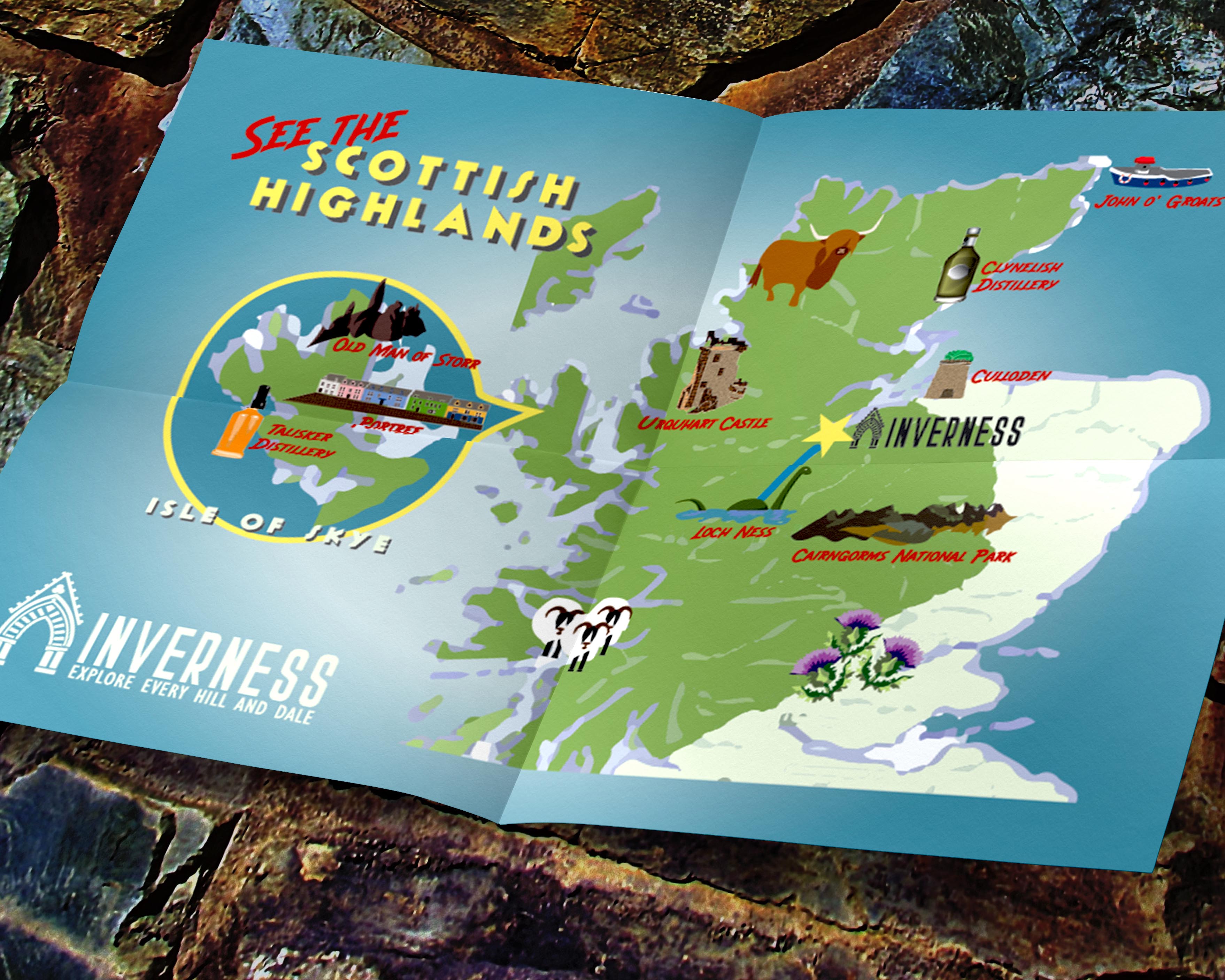
The City of Inverness was rebranding to promote tourism in the region. Settled in the fourth century, Inverness is a compact Scottish city perfect for exploration by foot. It is also an ideal base for day-trip adventures in the Highlands, with Culloden Battlefield, the mysterious Loch Ness, Urquhart and Eilean Donan Castles, and many other natural sites just a quick drive away.
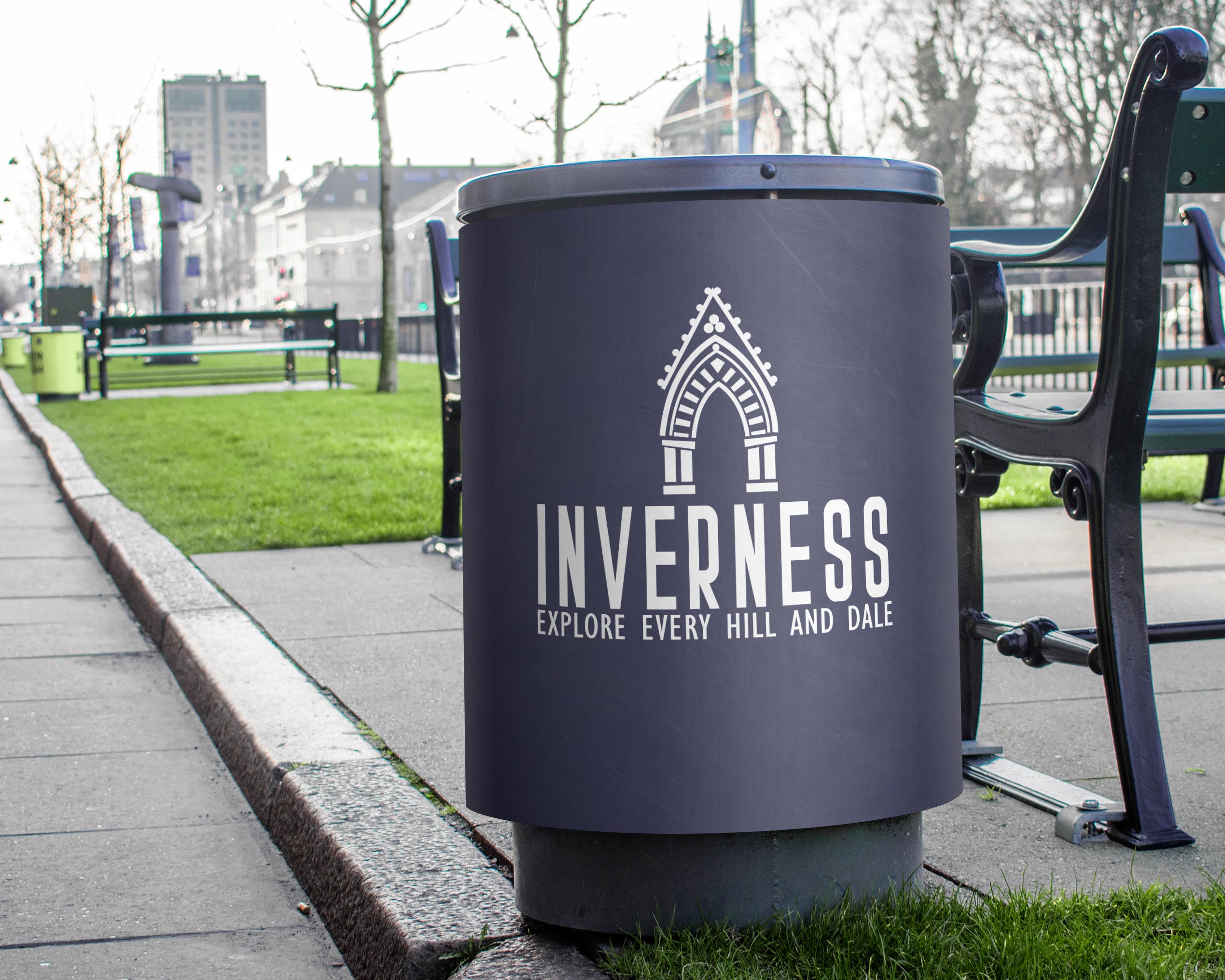
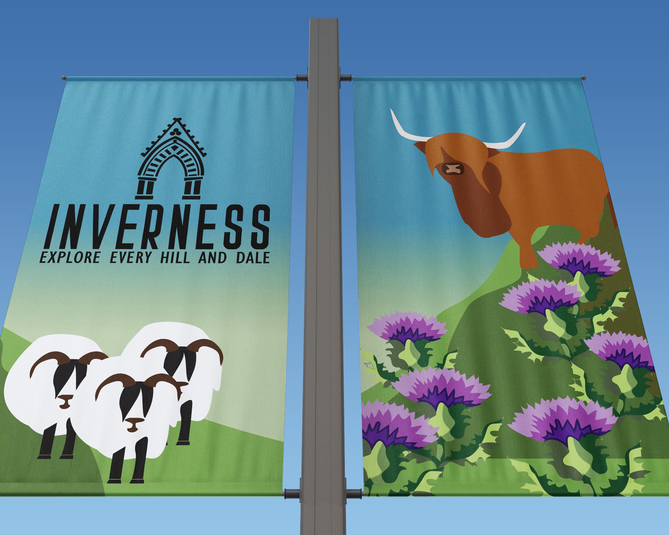
The goal of this campaign was to create branding appealing to both local and international visitors, with both a modern and historic sensibility. I designed the new logo around the colors of the local tartan, which, in turn, reflects the grays, blues, and greens of loch, sky and dale. The architectural detail, the entry to Inverness Cathedral, is one of the city’s most recognizable landmarks - a nod to the area’s rich architectural, cultural and spiritual traditions. The sans-serif typefaces utilized are vintage inspired modern , making this logo truly flexible for the city to use in both business and tourism. (speculative work)


