AD CAMPAIGN/
TECHNOMARINE
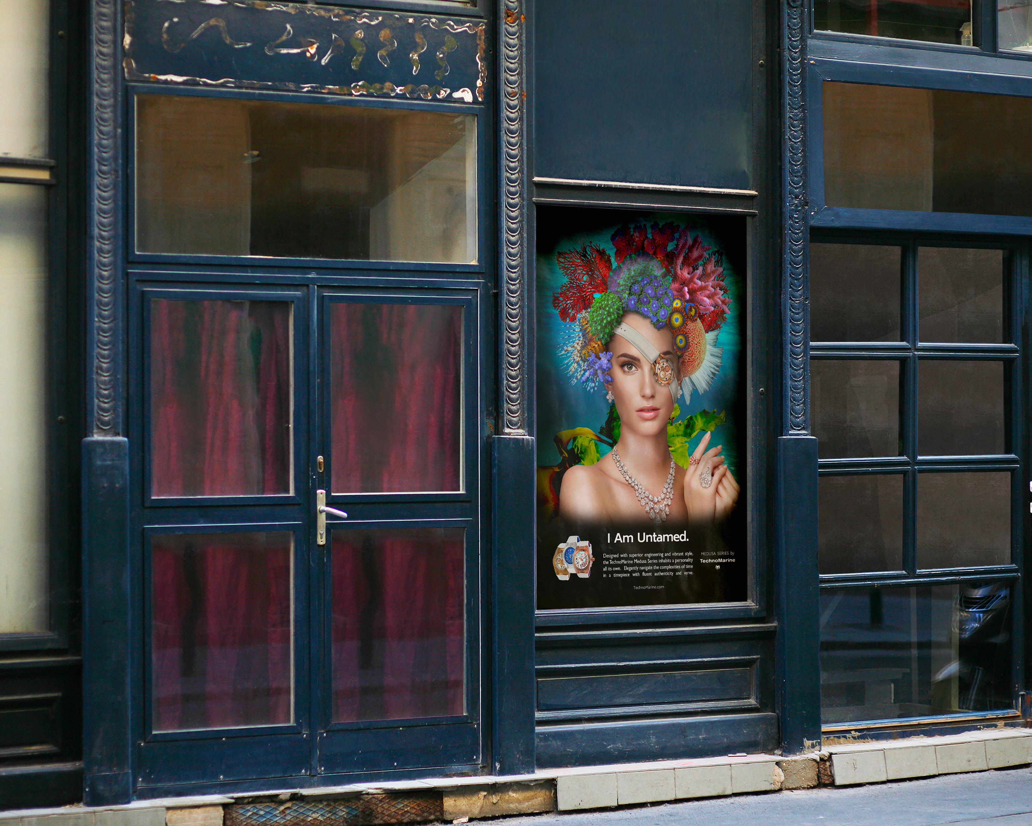
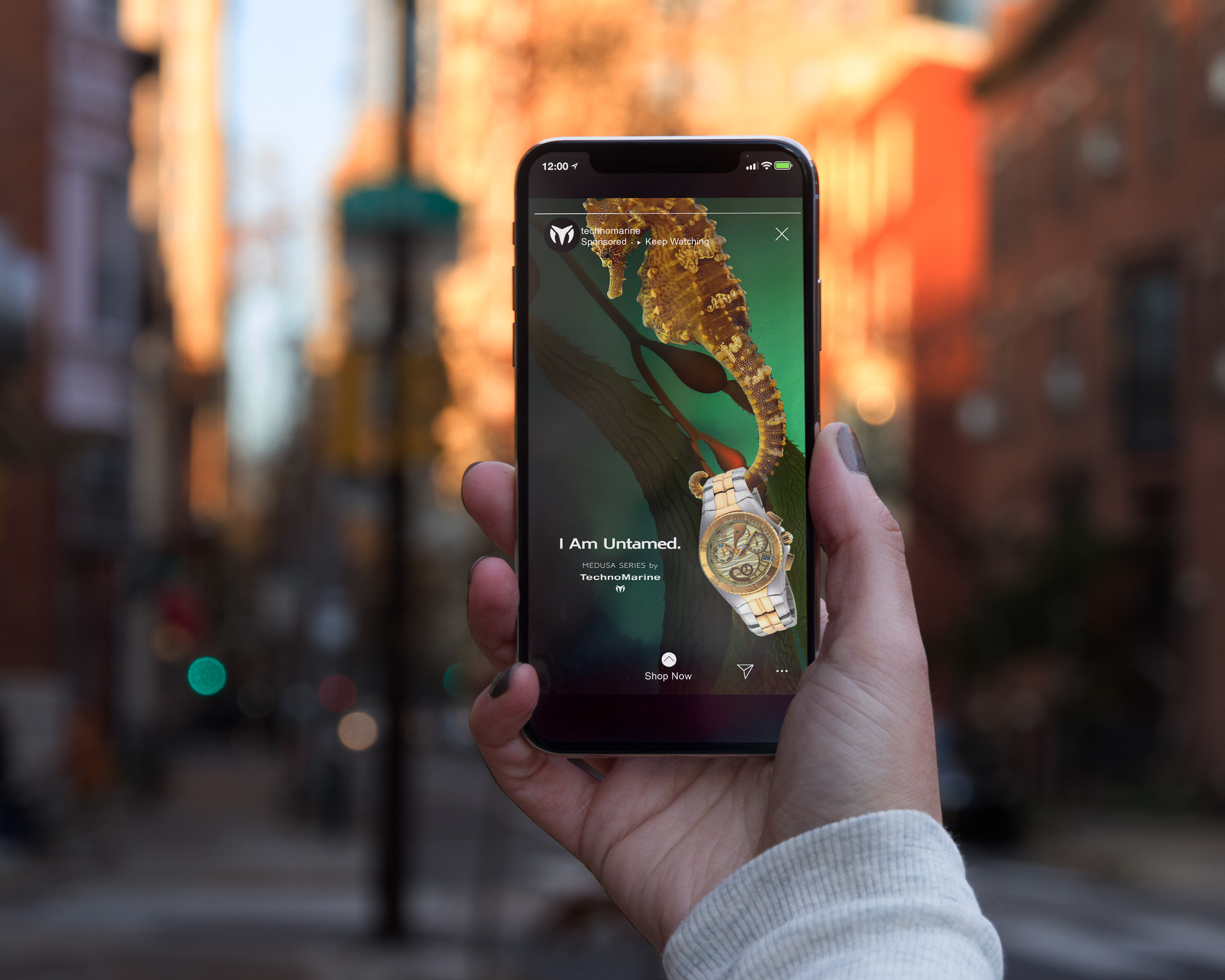
Focused on active luxury, TechnoMarine offers waterproof timepieces rich in dimension and attitude. Their product lines specialize in blending the art of horological innovation with spirited design. This spirit stylistically aligns with those who enjoy the combination of sophistication wit, originality and quality.
With the release of a new line, the Cruise Medusa Series, Technomarine wanted to create an ad campaign based on their award-winning ‘I Am Special’ campaign, but with a little ‘wilder’ sensibility to reflect the adventurous style of the Cruise Medusa. They had already signed celebrities Michael Ealy and Dalia Gunther to promote this line.
To capture the elegance and non-traditional style of the ‘Medusa’ theme, I created custom digital illustrations of mysterious marine personalities based on photos of Gunther and Ealy. In line with the “I Am Special” campaign, the characters wear timepieces as pirate-style eye patches. (speculative work)
TECHNOMARINE
Focused on active luxury, TechnoMarine offers waterproof timepieces rich in dimension and attitude. Their product lines specialize in blending the art of horological innovation with spirited design. This spirit stylistically aligns with those who enjoy the combination of sophistication wit, originality and quality.
With the release of a new line, the Cruise Medusa Series, Technomarine wanted to create an ad campaign based on their award-winning ‘I Am Special’ campaign, but with a little ‘wilder’ sensibility to reflect the adventurous style of the Cruise Medusa. They had already signed celebrities Michael Ealy and Dalia Gunther to promote this line.
To capture the elegance and non-traditional style of the ‘Medusa’ theme, I created custom digital illustrations of mysterious marine personalities based on photos of Gunther and Ealy. In line with the “I Am Special” campaign, the characters wear timepieces as pirate-style eye patches. (speculative work)

BRANDING CAMPAIGN/
PEEK-A-BOUTIQUE
Peek-a-Boutique is a higher-end clothing shop for babies and children run by parents for parents. They offer quality products with both organic and gender neutral options to appeal to a mainstream market of consumers. Peek-a-Boutique desired to create branding that is stylish, kid-friendly with a whimsical twist. Expressing an interest in bright, cheerful colors, they wanted to stay away from the traditional pastels and primary colors associated with babies and children.
I began by creating an illustration of a charming sloth with irresistable appeal to both parents and children. This winsome creature was popular with the client, who recognized the opportunity to build a central branding theme around this character. The logo’s combination of sans serif and hand-lettered style fonts establishes the boutique’s fun, modern, and accessible persona. I selected gender-neutral colors robins-egg blue and butternut for their cheerful modern feel. Stationery and tags were designed around environmentally friendly kraft and recycled content papers to reflect the client’s eco-chic ethic.
(speculative work)


BRANDING +WEBSITE/
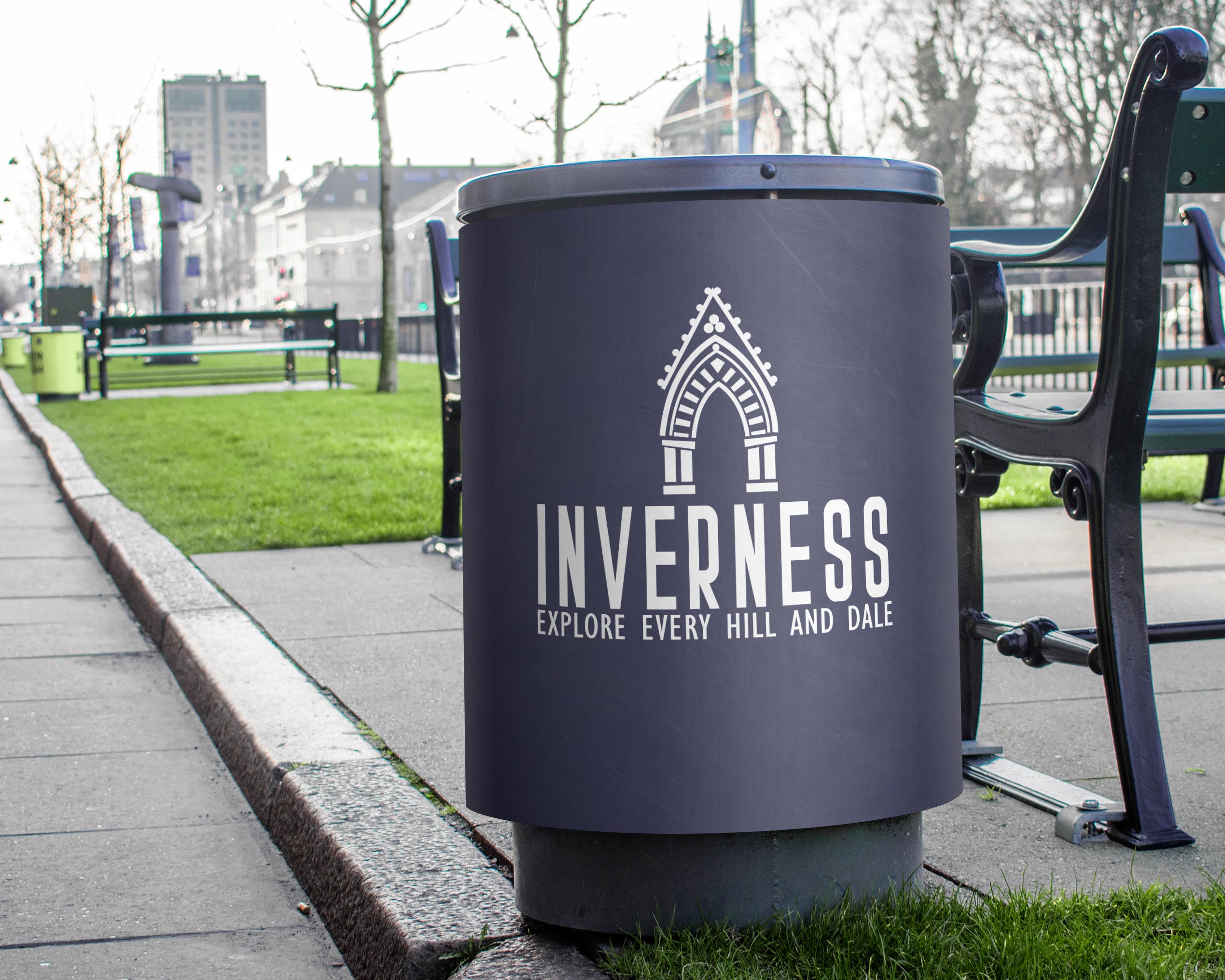
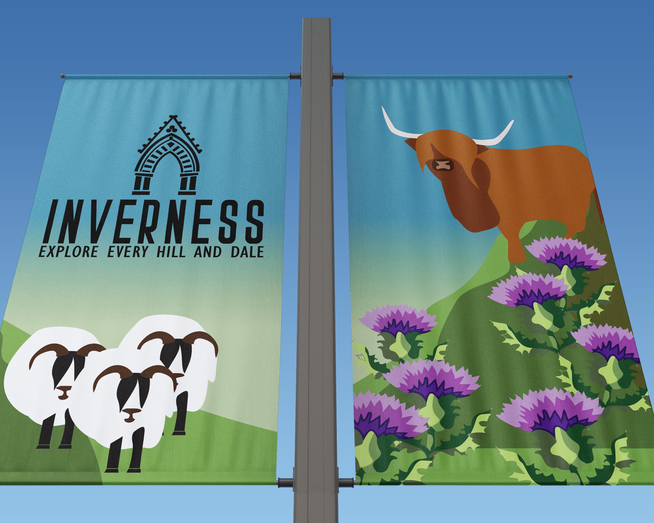
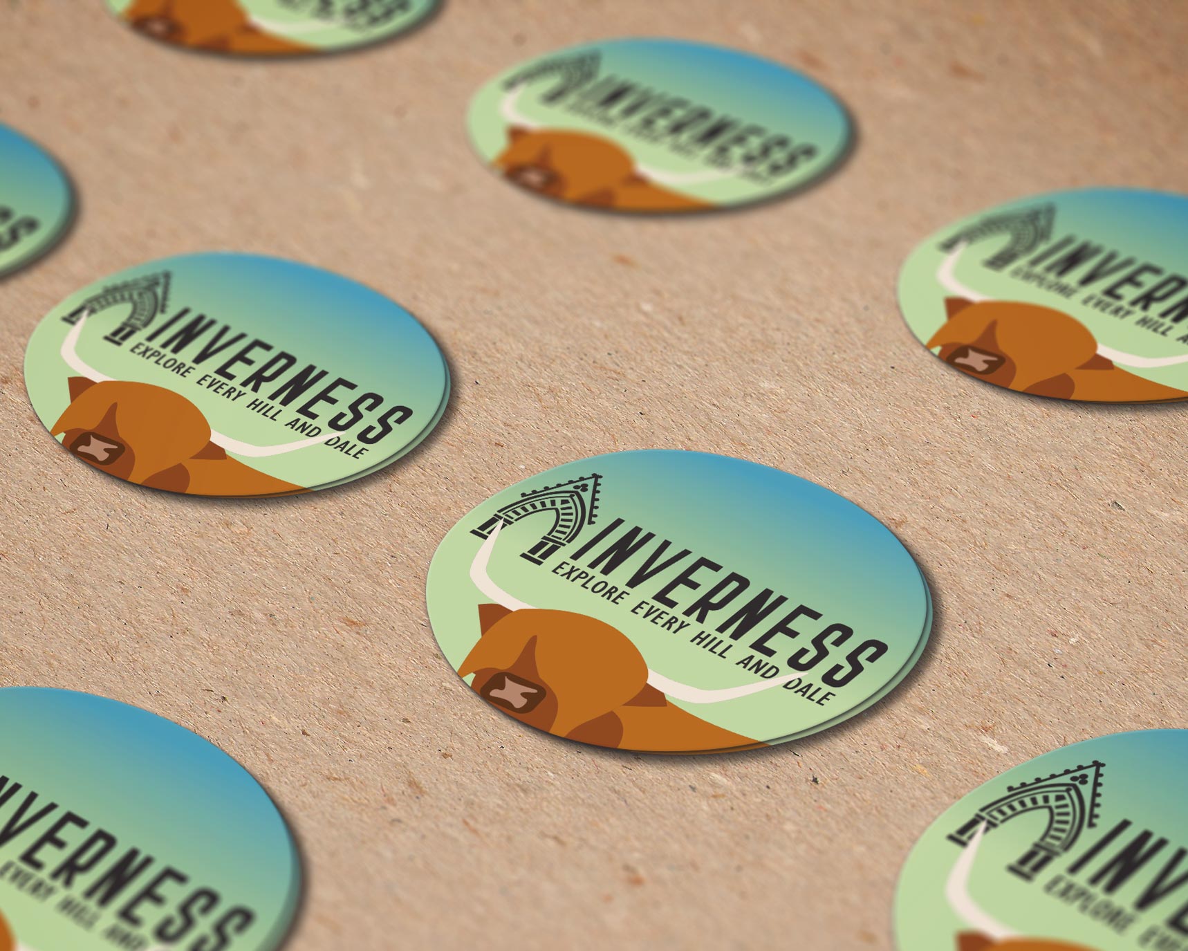
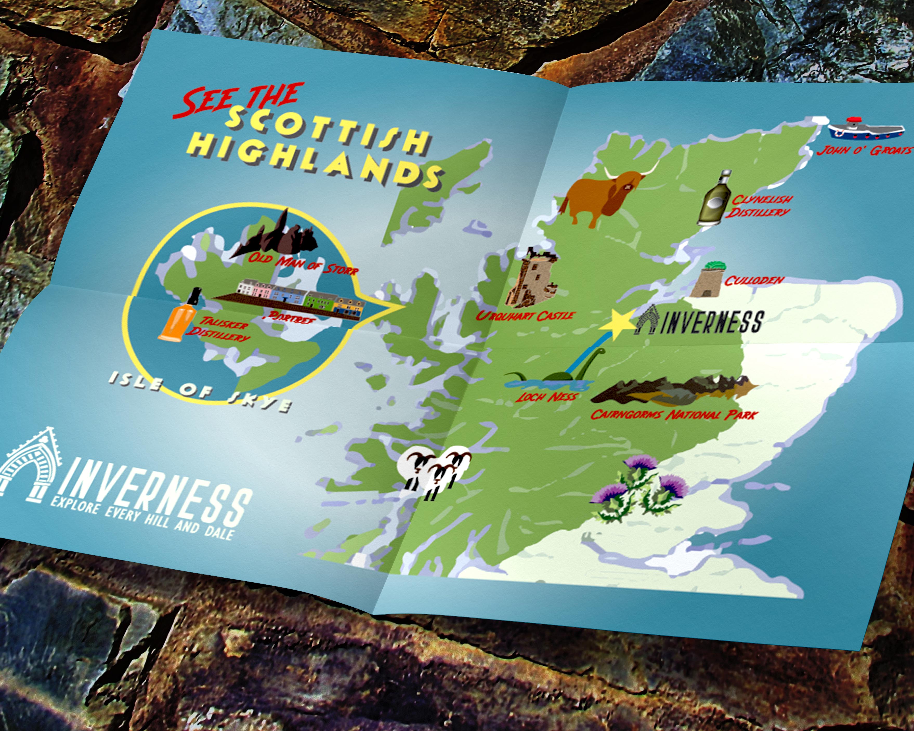
INVERNESS, SCOTLAND
The City of Inverness was rebranding to promote tourism in the region. Settled in the fourth century, Inverness is a compact Scottish city perfect for exploration by foot. It is also an ideal base for day-trip adventures in the Highlands, with Culloden Battlefield, the mysterious Loch Ness, Urquhart and Eilean Donan Castles, and many other natural sites just a quick drive away.
The goal of this campaign was to create branding appealing to both local and international visitors, with both a modern and historic sensibility. I designed the new logo around the colors of the local tartan, which, in turn, reflects the grays, blues, and greens of loch, sky and dale. The architectural detail, the entry to Inverness Cathedral, is one of the city’s most recognizable landmarks - a nod to the area’s rich architectural, cultural and spiritual traditions. The sans-serif typefaces utilized are vintage inspired modern , making this logo truly flexible for the city to use in both business and tourism. (speculative work)


BRANDING+WEBSITE/
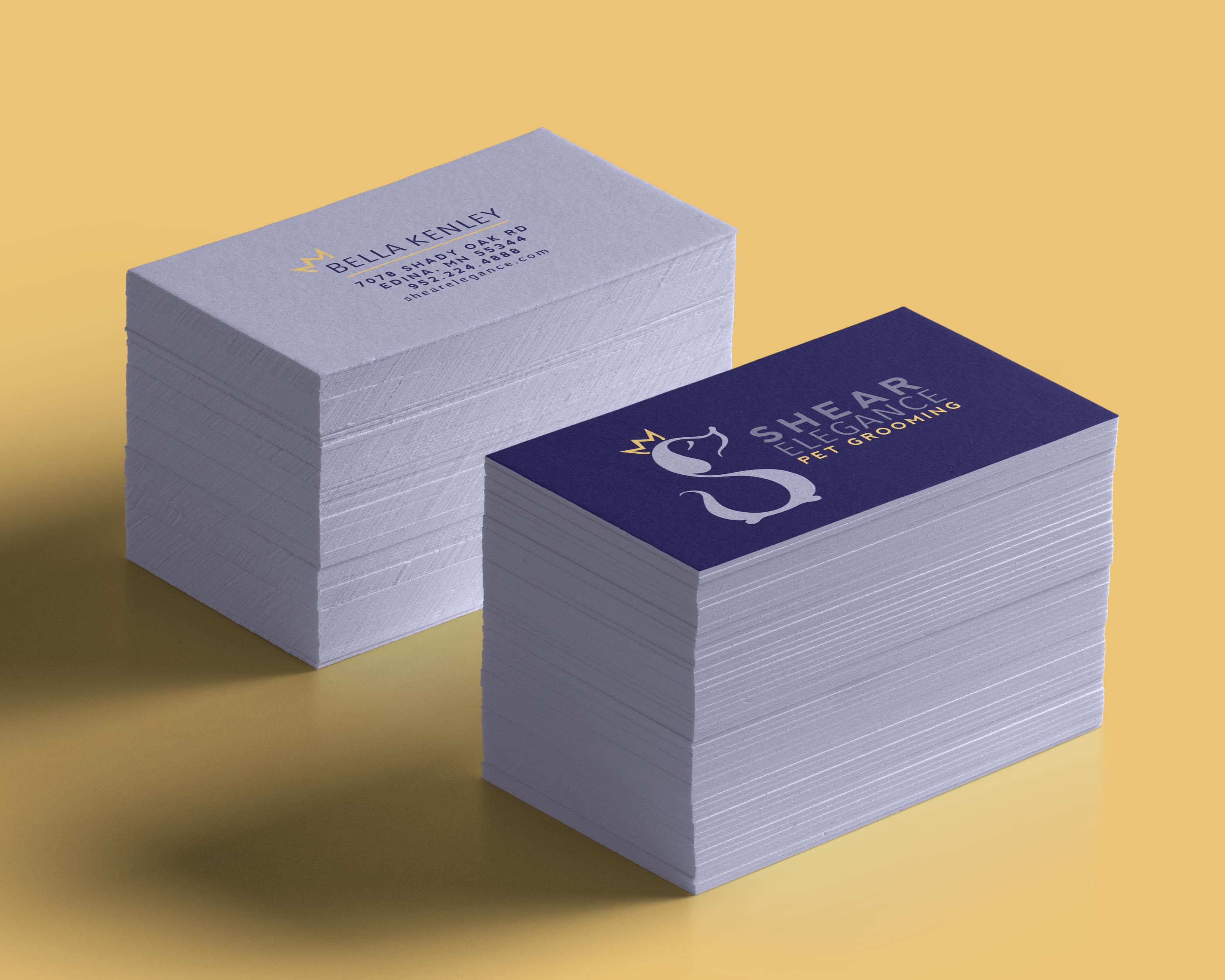
SHEAR ELEGANCE
A local pet salon offering excellent service, Shear Elegance had a solid customer base for their basic grooming services. But with an expansion of services offered to include massage, they wished to update their image and website. They wanted branding with a more upscale ‘pet spa’ feel, yet also a sense of whimsy. They recognized that many customers access their website on the fly from mobile devices, and they needed to incorporate responsive web design to offer the best user experience.
With an updated royal palette of blues and gold, and modern sans serif fonts, I recreated Shear Elegance’s logo with a charming, yet regal monogram in the shape of a dog. To update their internet presence, I created a fluid, one-page website with a stacked design. I ensured an upscale, yet fun, feel by incorporating images of dogs receiving their services in elegant spa-like settings. (speculative work)

POSTER DESIGN
/
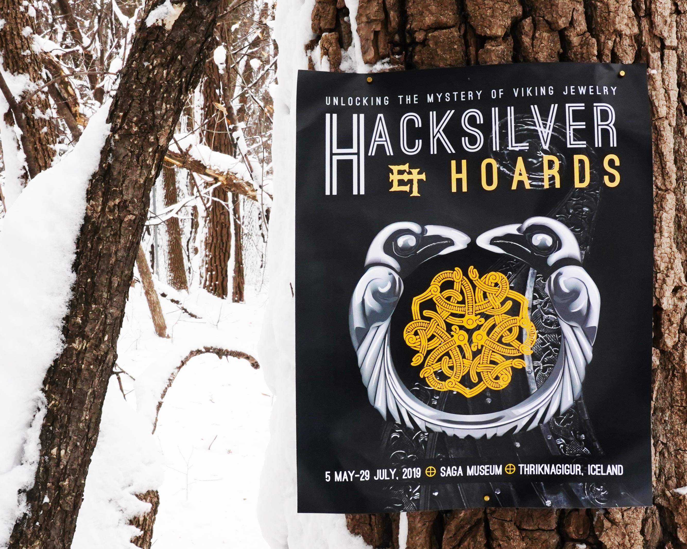
SAGA MUSEUM EXHIBIT
Hacksilver & Hoards is an exhibit designed to guide Saga Museum visitors on an exploration of the practice and purpose of hiding treasure. The Viking Age was a period of intensive deposition of metals in the history of Europe. The hoards deposited by Viking raiders during this era are thought to have served varied functions - economic, religious, and political.
The project blends custom photo-real illustration and photography to promote the exhibit in a manner evoking both the culture and peoples at the center of the mystery.
(speculative work)